Our thoughts on web accessibility
Our main goal with the page, was to make an easily accessible webpage. To ensure that, we used different tools to help us understand how a webpage become accessible to most people. We used WAVE a lot to scan the webpage to make sure the contrast and structure were satisfying (wave webpage).
A small note on the automated tests. When we get a contrast warning, as we did on our “logo” on the landing page, we need to consider the purpose of the element. In this case its not really text that requires the same contrast as if it were several paragraphs, and more like a logo or purely visual element. Its important to balance the look of the page and the accessibility. In most casing making a page more accessible also makes it better looking, but in this case we left the logo as is.
One of the things we had in mind when thinking about asseccibility, was to navigate the page by keybord. And while navigating around we found that the focus was to invisible, so we made the focus outline-width and outline-offset lager. Here is an example of before and after the focus was chanced.

When it comes to links we tried to give every link a short and precise name. We also made every external link open in a new window. And the ones from our own page, like the ones in the nav bar, will not open a new window.
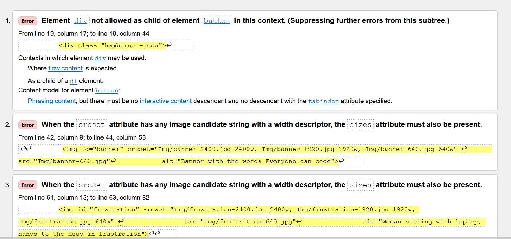
We ran our code in the W3C html validator and found that, even after working with the img tag, there were still some problems. We fixed the issues W3C suggested in the index page (See the screenshot from html validator below).
We wanted the pictures to load according to the users internet speed, and the size of the screen. We used all the attributes for this in the index page, but please notice that the pictures on the other pages may vary from this structure. For example on this page we have some small example off our code. These pictures are not ment to be in any high resolution, but it´s ment to be small and just as an illustration.
When it comes to the text and paragraphs on our page we wanted everything to have the same style and be very readable. To accomplish this we created a utility class called "".text" that is used on all containers that contain several lines of text in paragraphs. This class makes sure the distance between lines, words and paragraphs is optimized for readability. And also sets the max length of a line to 75ch.